
From the initial concept, Rina requested a simple and elegant design. The color choices approved consisted of warm tones, specifically yellows, oranges, and vibrant reds. A glow effect became a key design feature Rina wanted in the logo. For type, she preferred bold and round typefaces that were sans serif, but it was open for discussion as the logo developed.
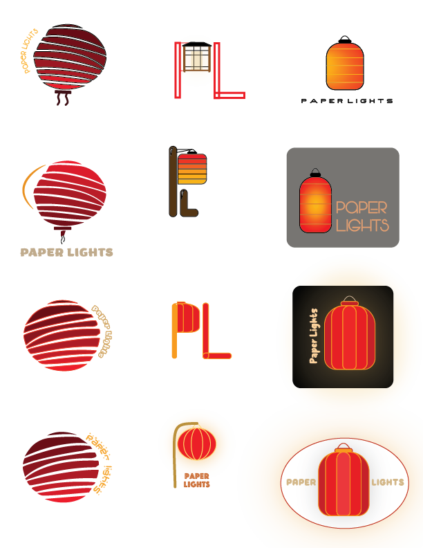
Logo Sketches
Rina became drawn to the logo on the first column second row after shown the logo variations. After critique and review, the logo was tweaked and combined with the color gradient on the third column of sketches.


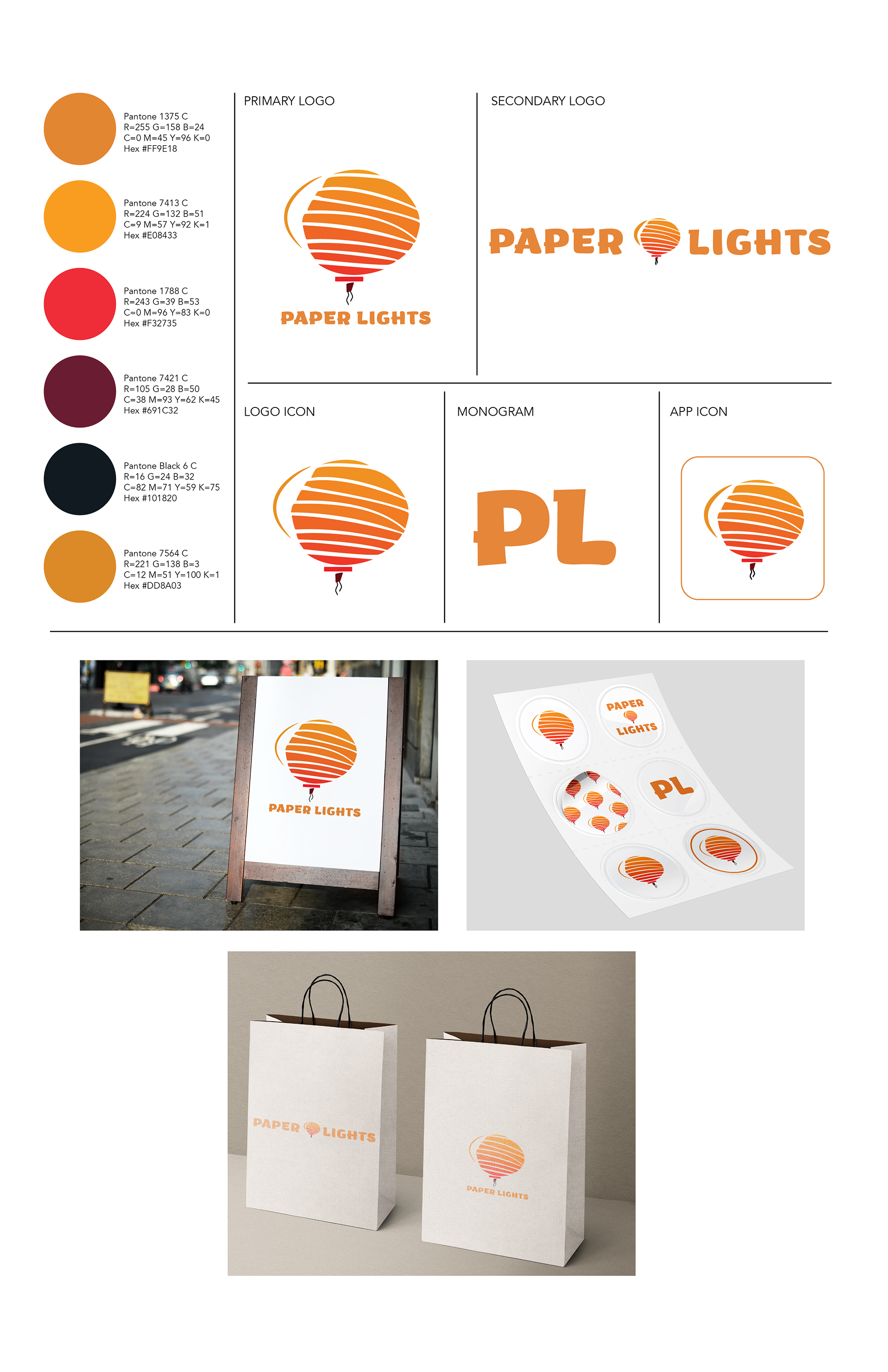
Brand kit for Paper Lights
After the brand kit, it was time to start with UI/UX design.
Goal
Create a user-friendly website to navigate store details and a pleasant shopping experience for consumers wishing to make paper lanterns. It was vital to make it approachable for customers to book appointments for this hands-on experience.
Wireframing
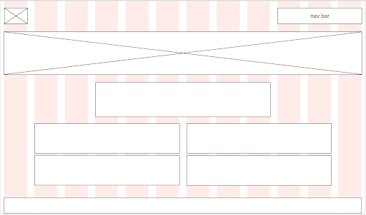
Wireframe for the homepage
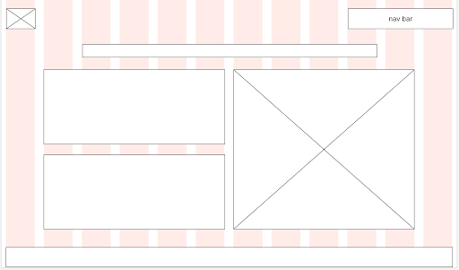
Wireframe for the location tab
After completing the wireframe, it was time to set it up in HTML. I used Adobe Dreamweaver to set up the columns and grids to match the wireframes. Now it was time to implement logos and colors, I decided it was best to keep the webpage with a white background to accentuate the vibrant logo. The footer is orange to keep a consistent color scheme that looks visually appealing while following the color contrast rules for accessibility.
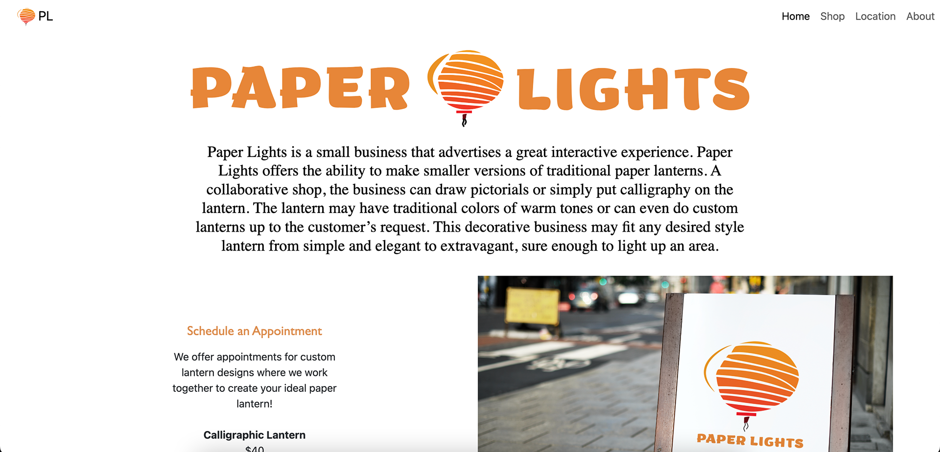
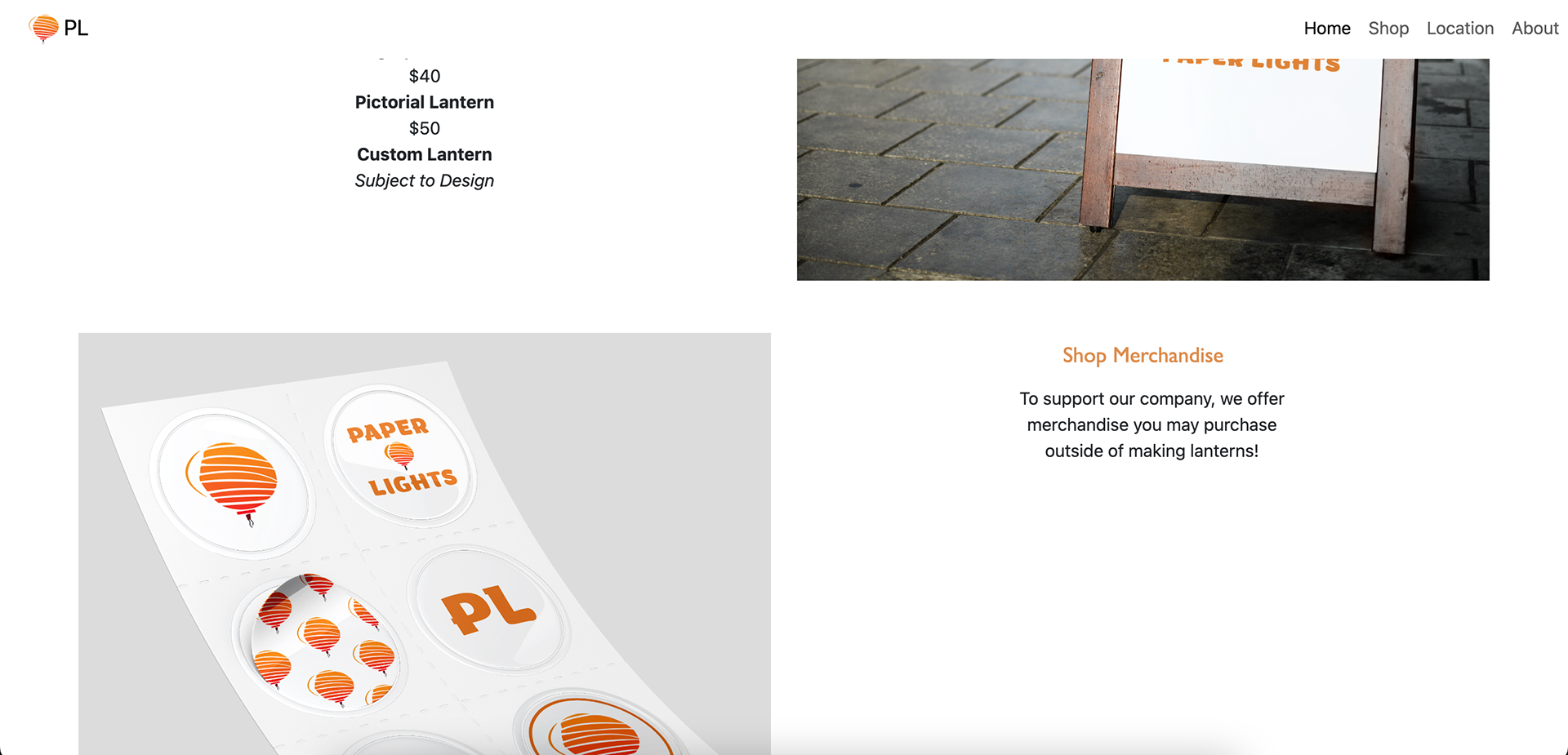
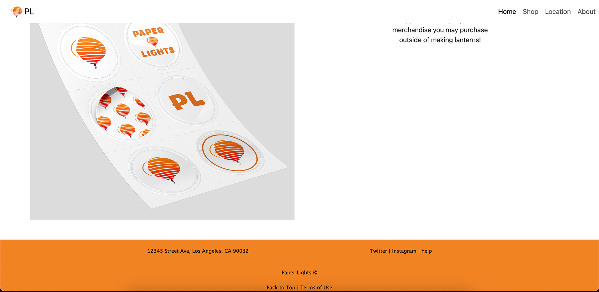
Finished Homepage
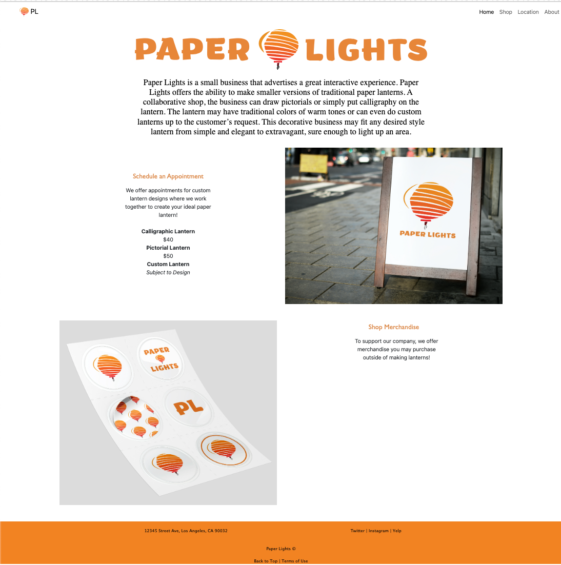
Below demonstrates how the webpage looks on a desktop, scrolling from top to bottom.
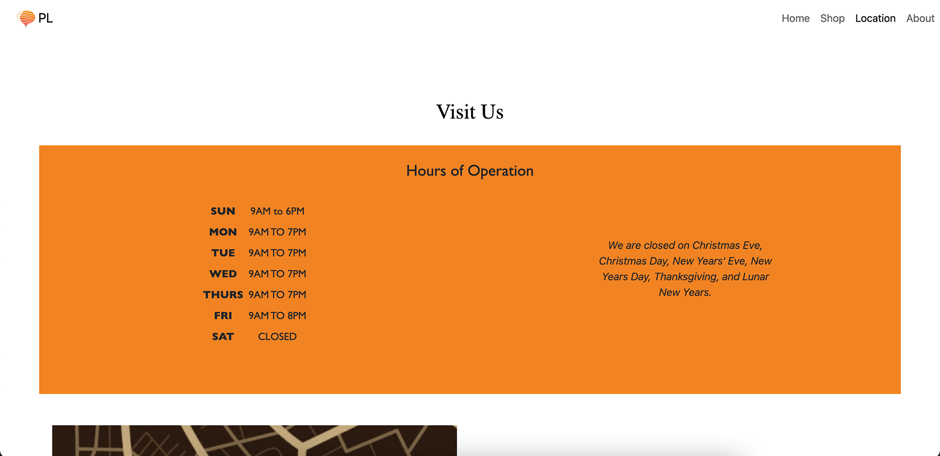
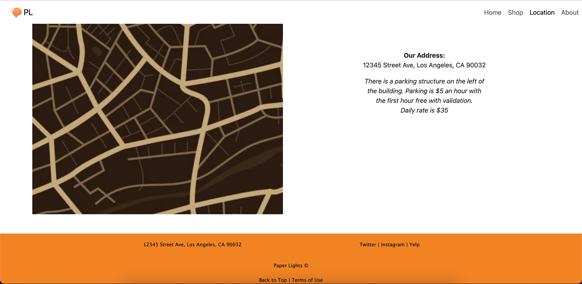
Finalized Location Tab
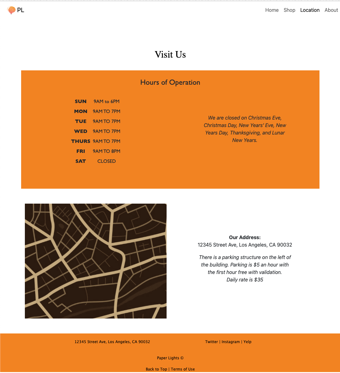
Below demonstrates how the webpage looks on a desktop, scrolling from top to bottom.
Successes
After completing the branding and UI/UX, the opportunities to expand were endless. The color of the brand is very attention-grabbing while maintaining a simplistic and elegant vision. The design provided dimensions that fit well with or without typography. The overall function of the webpage is easy to navigate, being able to book an appointment or shop the merchandise all within the front page of entering the website.